WE MAKE COMICS!
/Works from Mason’s Dynamic Publishing Program
April 27 - May 29, 2022
Fenwick Gallery @ Fenwick Library, Fairfax Campus
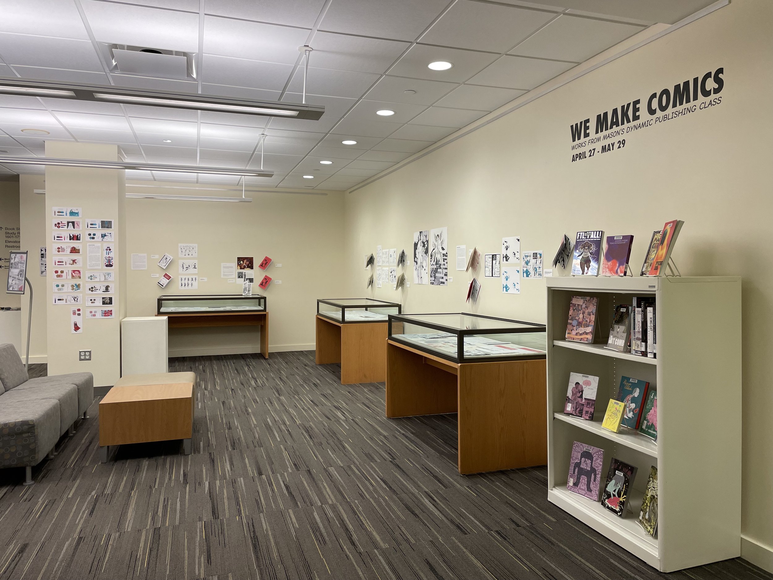
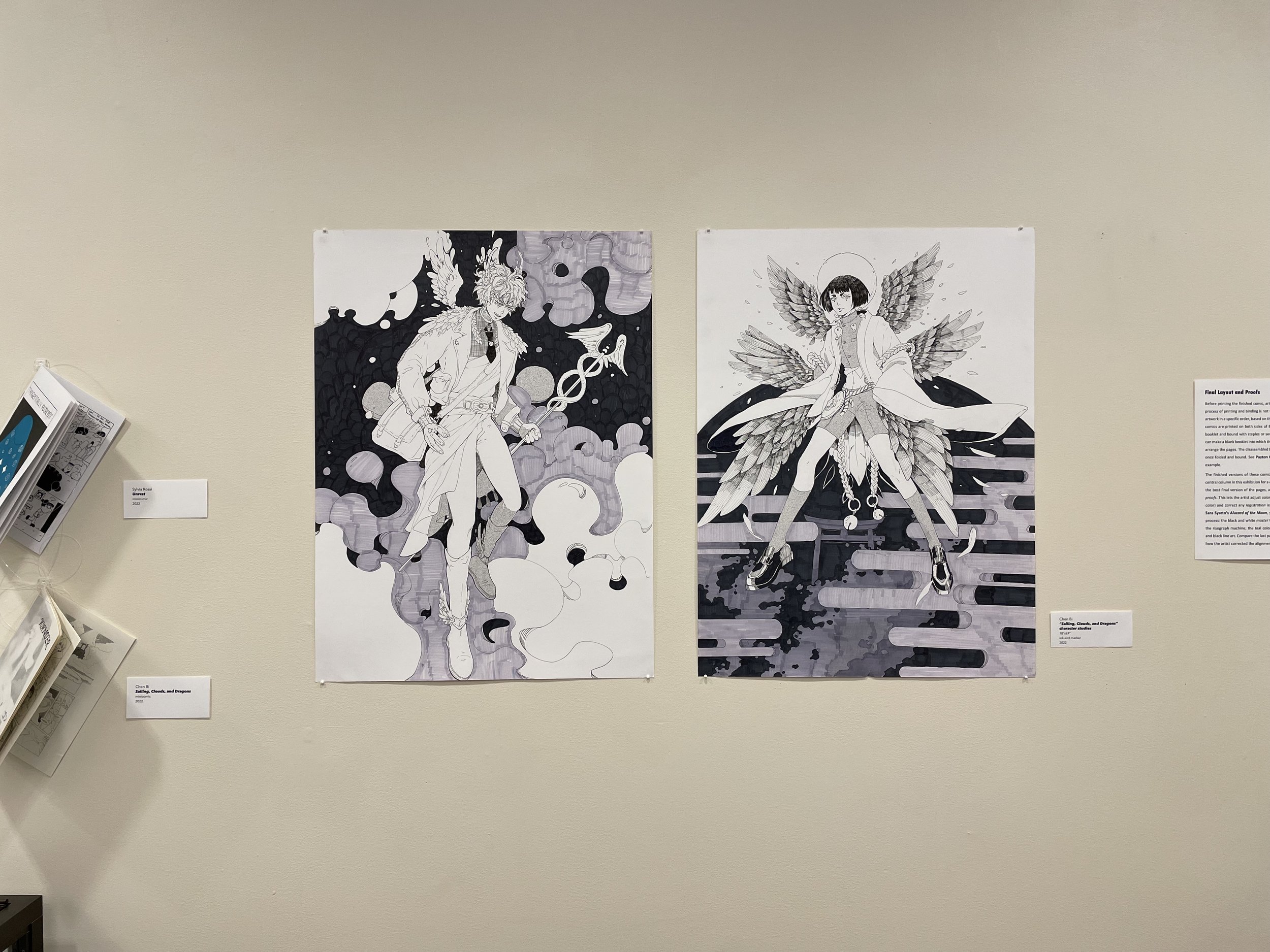
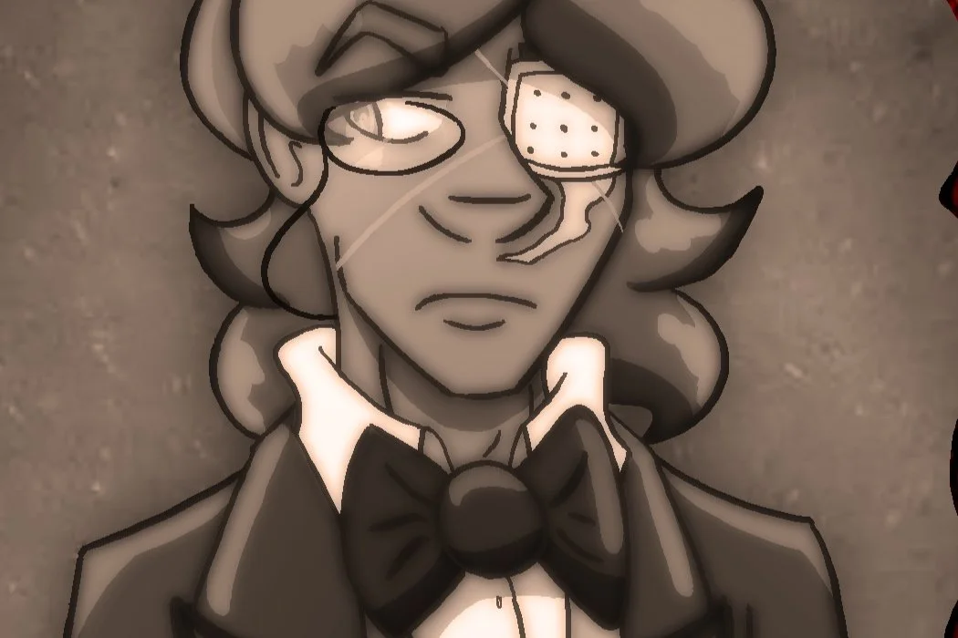
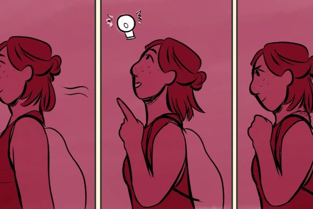
“We Make Comics!” showcases the process of creating comics from first pitch through final print, and features work from the inaugural DYNAMIC PUBLISHING course in Mason’s School of Art led by Prof. Christopher Kardambikis. Students in this class developed minicomics (short, self-published comics) in multiple genres, from science fiction to fantasy and slice-of-life. These artists worked in a range of media through the sketch and design stages and produced the final version of their comics using Risograph printing. The exhibition presents story outlines and notes, character sketches, and rough drafts alongside the finished minicomics, demonstrating the breadth of the creative process and showing how much a story can change during development and final printing.
The Process of Comics Production
-
Before fully committing to a script or drawings, the artist drafts an overview of the general “shape” for their story, characters, settings, and other key elements of the story. This is a common step for both professional work and the more personal, self-published work in this exhibit. Through this process, an artist can share broad ideas and consider any elements that may need clarification or expansion before writing a full script or drafting the comic’s layout.
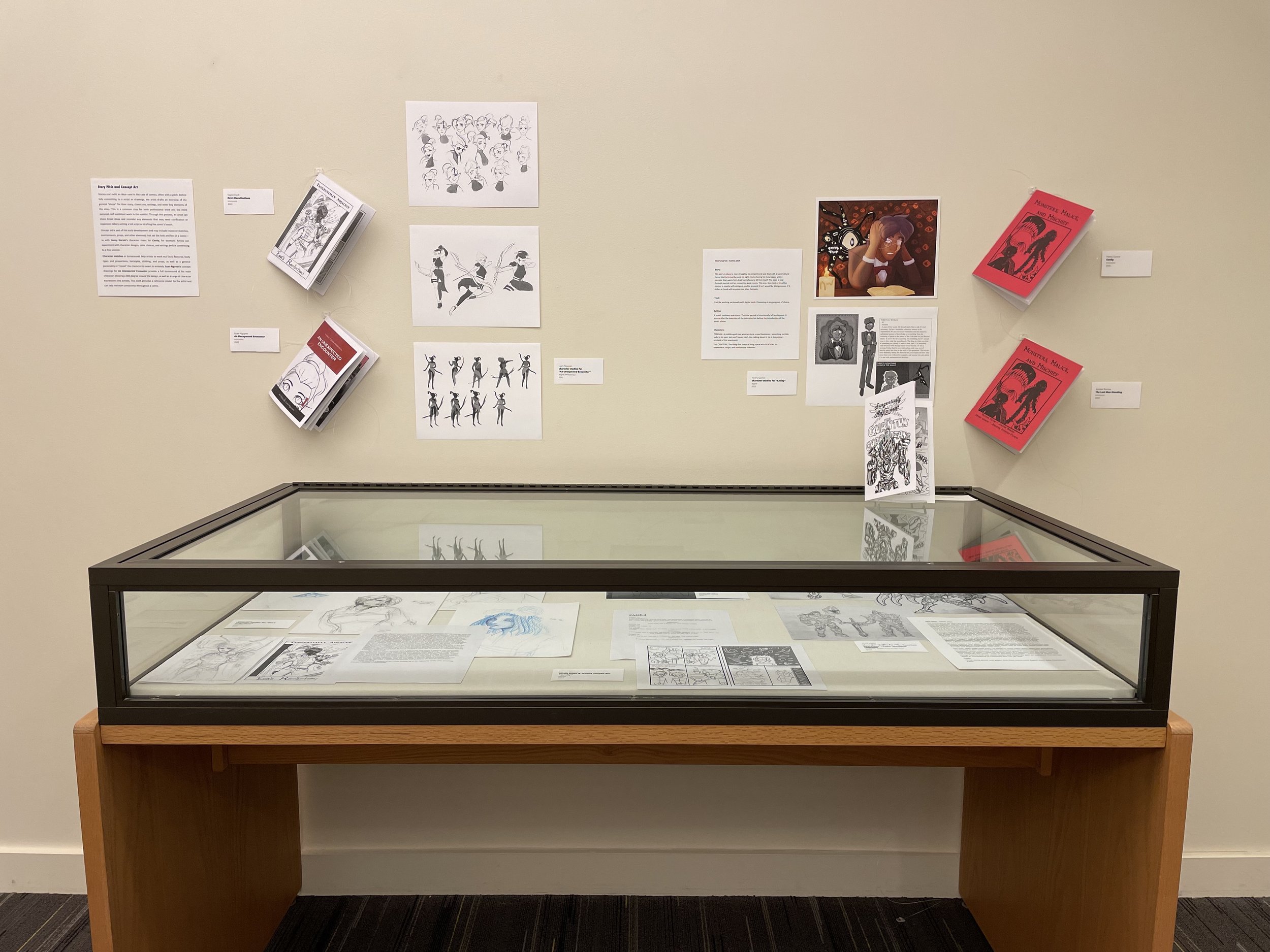
Concept art is part of this early development and may include character sketches, environments, props, and other elements that set the look and feel of a comic—as with Kaylyn Garvin’s character sheet for Cavity, for example. Artists can experiment with character designs, color choices, and settings before committing to a final version.
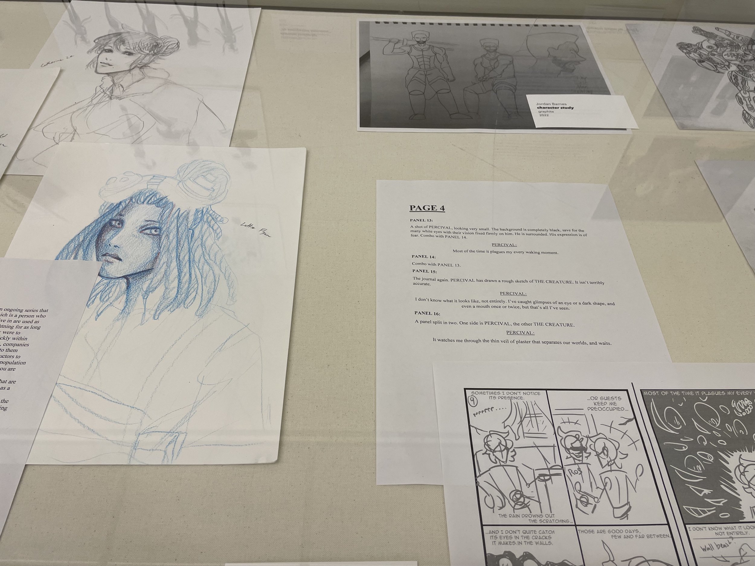
Character sketches or turnarounds help artists to work out facial features, body types and proportions, hairstyles, clothing, and props, as well as a general personality or “mood” the character is meant to embody. Luan Nguyen’s concept drawings for An Unexpected Encounter provide a full turnaround of his main character, showing a 360-degree view of the design, as well as a range of character expressions and actions. This work provides a reference model for the artist and can help maintain consistency throughout a comic.
-
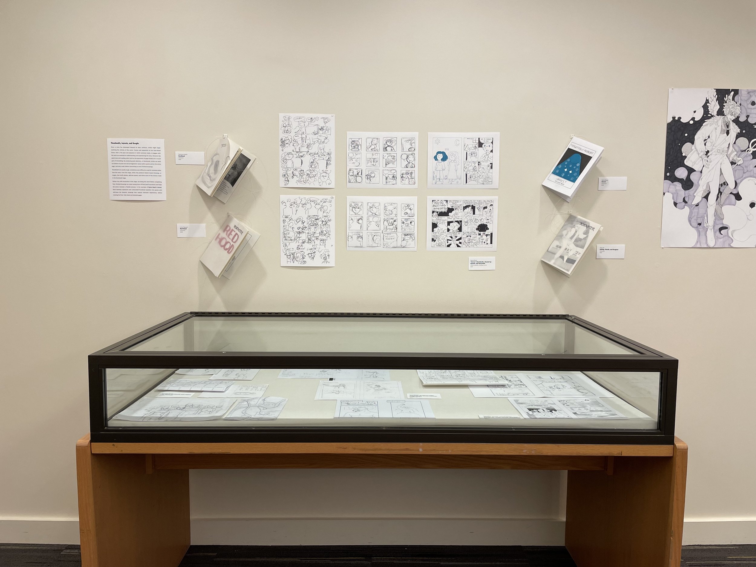
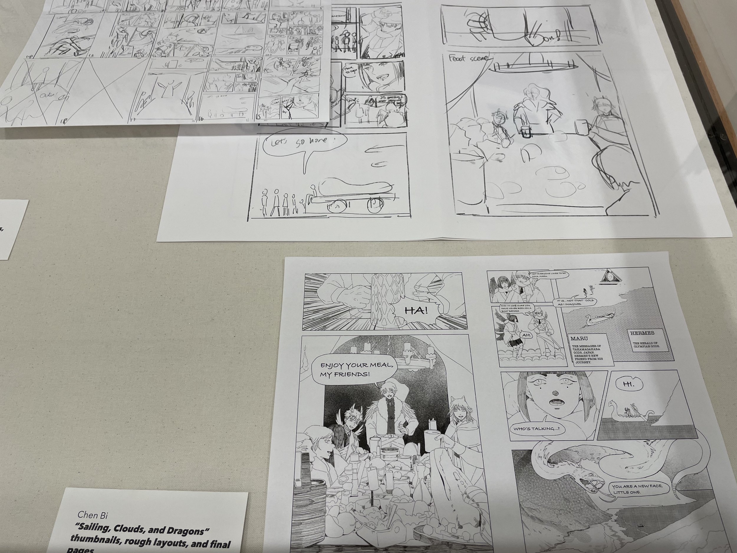
Once a story has developed beyond its basic contours, artists might begin outlining the entirety of the comic. Comics and sequential art are time-based forms: that is, the pace and sequence in which someone reads or engages with the work are essential to understanding and experiencing the story. Elements like panel sizes and reading order (such as the placement of page breaks) are a crucial part of storytelling. By producing quick sketches, or thumbnails, artists can work out details of panel size and arrangement, layout within panels and on the entire page, and story order before committing to more finished drawings.
Thumbnails are usually rough, sometimes even difficult to read for someone other than the artist. From this stage, artists may produce cleaner layout drawings, or roughs, that clarify details, add text panels, and refine some of the choices made in the thumbnail stage.
Stories may shift drastically at this stage, but doing this work before completing final, finished drawings can mean saving hours of time (and frustration) and helps the artists maintain a flexible process. In the example of Sylvia Rossi’s Unrest, Rossi develops expressive and unbounded thumbnail sketches into panels with still loose but dynamic drawings that capture character expressions, before creating the final, fully inked and lettered pages.
-
Before printing the finished comic, artists create a mock-up of the full book. The process of printing and binding is not straightforward and requires arranging the artwork in a specific order, based on the total number of pages in the book. These comics are printed on both sides of 8 ½” x 11” paper, folded in half to make a booklet and bound with staples or sewn. To determine the correct order, artists can make a blank booklet into which they paste their artwork, or they may digitally arrange the pages. The disassembled book appears jumbled, but reveals its order once folded and bound. See Payton Crain’s A Cryptic Comedy for one mock-up example.
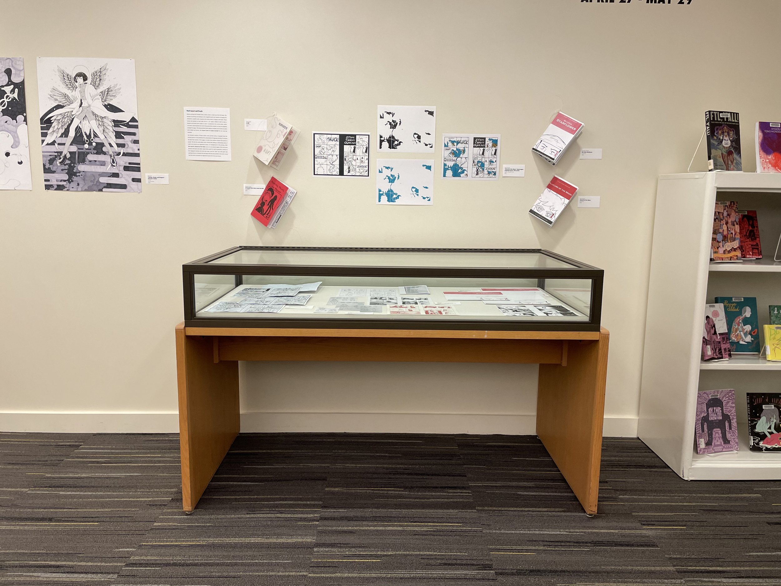
The finished versions of these comics were printed using a risograph (see the central column in this exhibition for a description of risograph printing.) To ensure the best final version of the pages, an artist may produce several test prints or proofs. This lets the artist adjust color choices (like adding or eliminating areas of color) and correct any registration issues, or misalignment in the printing. With Sara Syarto’s Alucard of the Moon, you can see several stages of the test print process: the black and white master that would be used to generate a stencil on the risograph machine; the teal color layer; and the “final” test with gold, teal, and black line art. Compare the last page with the same panels in the comic to see how the artist corrected the alignment issues from the test version.
-
Risograph machines were once commonly found in schools and offices and have more recently been adopted by artists and cartoonists as a unique printing medium. The printer resembles a copy machine, but the process is akin to screen printing as each color layer must be printed separately and in a particular order. Because of this, artists working on the risograph (or “riso”) might limit their prints to one or two colors.
To start, the artist places an original drawing on the riso scanner and inserts a drum of color ink into the machine. The riso generates a master (essentially a stencil) of the image. As each page is printed, ink is pushed through the master onto the print. To add another color, the artist inserts a different color drum and creates a new master, which is then printed over the first color layer.
The comics in this exhibition use two or three colors, meaning each page passed through the risograph printer multiple times. The resulting prints are distinct with bold colors and textured layers of ink.
Contributing Artists
Installation Views
